Handoff Tech
Role: UX Designer & Strategist.
Skills: User Research, UX Strategy, Service Design.
Project Length: July-August 2020.
Tools Used: Figma, Miro, SurveyMonkey.
Overview:
Background & Challenge: Handoff is a Colorado-based on demand alcohol delivery service partnered with breweries and liquor stores in the Denver and New York areas, promising one hour delivery and a variety of tools to get it.
Handoff hired on my team to improve upon a concept already developed, but lacking in direction and detail: a widget where users could order fast alcohol delivery through a third-party website. The widget would take the form of an A.I. chatbot that users could order through, using button-based interactions in a conversational format.
Results: The Handoff team was thrilled that we were able to direct the widget in a way that directly involved Denver’s microbrewing community, giving the company more to offer when striking new third-party partnership deals. The project was a huge success in expanding Handoff’s market share, making it more attractive to microbrewers for partnership, and getting the wheels turning for innovative avenues in the future.
Approach:
While the tool was already developed in the back end, the Handoff team was undecided on where the widget should live and presented us with two options:
In the first option, the widget would live on the pages of alcohol brands, allowing users to order through a third party in one streamlined visit. The second consists of the widget on a liquor store website, offering AI-based recommendations before the commerce process. In both iterations, Handoff gave us three non-negotiable principles:
While these requirements seem straightforward enough, a widget using a chat-based format for e-commerce proved to be unusual territory. Handoff’s initial research, and our own proved that the problem was much more complex than it’d appear on paper.
Research:
Preliminary Survey: While our survey indeed indicated that our potential users were primarily on the younger side, they were not quite as young as the client had assumed, with 28 being the median age.
In addition, we found that our potential users were both interested in small/local alcohol brands, and tend to be loyal to the brands they like. This was an important piece of the puzzle for the team, as it lines up with Handoffs sudden boom in business when they decided to offer exclusively small, local alcohol brands at the outset of the COVID-19 pandemic. This, in addition to the finding that users don’t often visit the websites of brick and mortar alcohol retailers, led us to scope down the project to focus on the version of the widget on alcohol producer sites.
In addition, we found that our potential users were both interested in small/local alcohol brands, and tend to be loyal to the brands they like. This was an important piece of the puzzle for the team, as it lines up with Handoffs sudden boom in business when they decided to offer exclusively small, local alcohol brands at the outset of the COVID-19 pandemic. This, in addition to the finding that users don’t often visit the websites of brick and mortar alcohol retailers, led us to scope down the project to focus on the version of the widget on alcohol producer sites.
User Interviews:
Based on the survey results, we interviewed seven potential users to get their impressions of the Handoff Widget, identifying 3 key issues with the widget as it stood:
1. Users have existing negative views toward chatbots.
All users had extremely negative views toward chat-bots, regardless of their intent or whether they needed help. User responses ranged from those related to the “uncanny valley” of speaking to an obvious robot all the way to finding them akin to pop-ups: something you ignore and resent that you must ignore.
2. Users don’t assume you can order through a widget.
Beyond user perception of chat-bots in general, Handoff’s general concept was extremely unclear to users. Even with the inclusion of text reading “Click Here for Fast Delivery!”, users perceived this as still being related to the broader concept of “help”.
3. USERs don’t trust Widgets with payment
When led down the path of using Handoff’s widget (despite their disinterest and confusion towards it), there were severe hangups and reservations during the checkout process. Related to Insights 1 and 2, users’ perception of chatbots being akin to pop-ups and their lack of experience with widgets that handle ordering made them nervous about entering sensitive, personal information.
When we asked our interview participants about buying smaller brands of alcohol, they closely mirrored our survey results. Almost all preferred drinking small, local producers, and did so not only because it was thought to be higher quality, but they felt a sense of importance and pride in supporting small businesses.
CARD**: Millennial drinkers need a simple and trustworthy tool so that they can directly support the small breweries they love, with the convenience of larger brands.
So, what are we solving?
Millenial drinkers need a simple and trustworthy tool so that they can directly support the small breweries they love, with the convenience of larger brands.
Ideation & Testing:
For our next round of testing, we prototyped four major concepts on how we could improve the clarity and trustworthiness of the Handoff widget and tested each with six users.
Concept 1: Non-chat formatting.
Evaluation: Users found centered buttons and small products, expanded when clicked very comfortable and familiar, a vast improvement over the chat-formatting that the first testers resoundingly disliked.
Concept 2: Widget Placement and CTA Animation
Evaluation: We hypothesized that the placement of the widget could have a substantial effect on user perception of its utility. After testing all four corners, this proved to be a dead end. While users at first associated the bottom-right placement of the widget with “help”, when presented with the widget in the other corners the outcome was worse: obtrusive pop-ups.
Concept 3: Third-Party Payment
Evaluation: Third-party branding seemed to be the key to trustworthy transactions. Interestingly, users who did not actively use, or were interested in using Apple Pay still liked having it as an option because of its perceived security. This perceived security was in turn lent to the rest of the Handoff widget
Concept 4: Site Integration
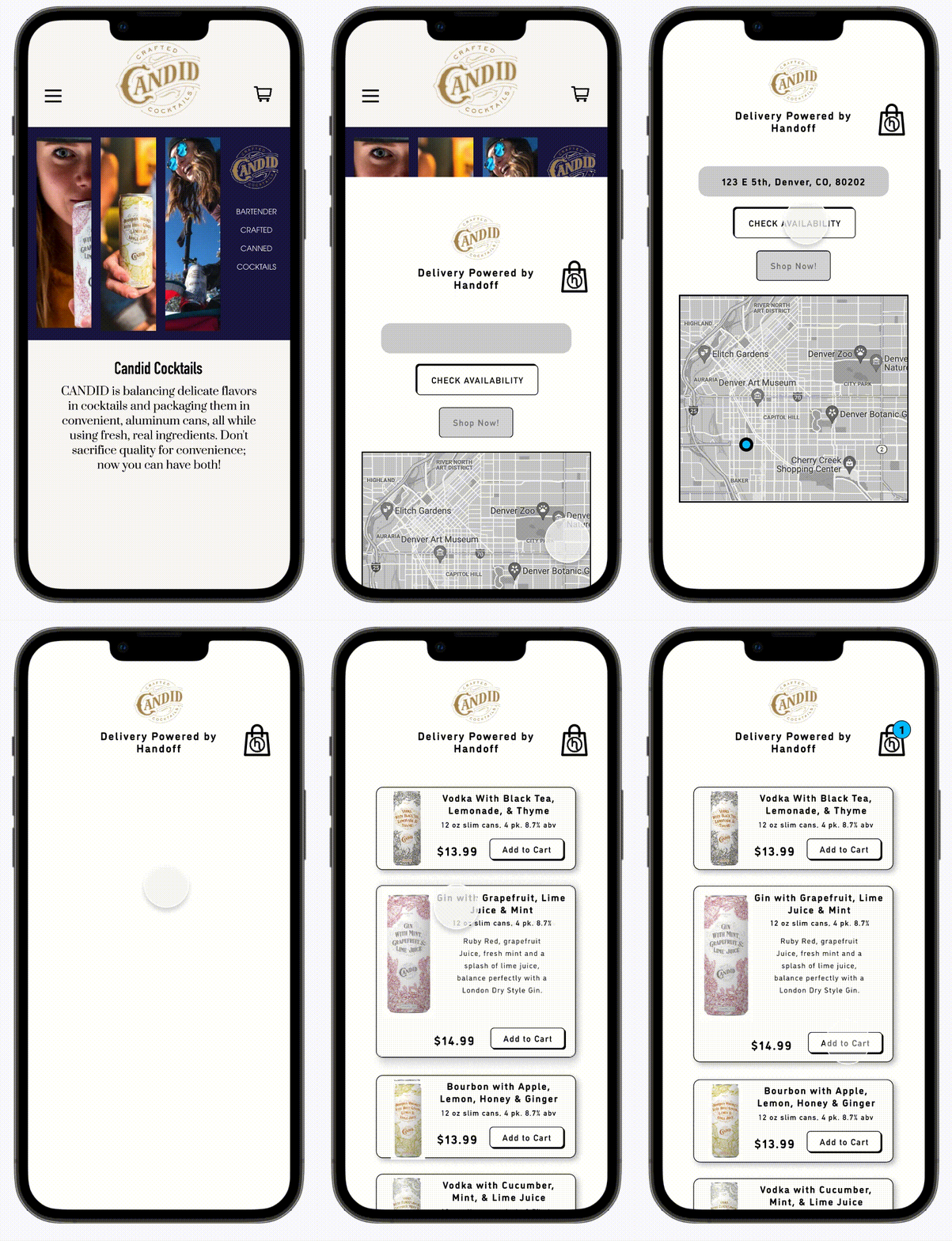
Evaluation: To make the experience of shopping in the widget as familiar as possible, we tested adding buttons to the host-site’s product page so that users could use the site’s navigation to search for products, using the widget as a feature-rich cart. In turn, this would also solve the nagging problem of user confusion over having to separate carts (one for Handoff, one for the Host site). This was remarkably successful, however, fully replacing the cart was not deemed possible by the Handoff team.
Final DeSIGN: Integration = Trust
While we couldn't fully replace third-party sites with the handoff widget, we could however mimic this effect by keeping buttons on the product page that open the widget on click, or alternately adding a simple button in the site’s top navigation was just as successful upon testing. Keeping the navigation in-site was successful both in terms of making the widget clear and simple to use, as well as lending a sense of trustworthiness through its integration.
Results and Next Steps:
Handoff’s new widget benefited greatly from its further integration into the host producer’s site. Time-per-task was reduced by 75% almost purely because its purpose was clarified via removing its chat formatting. Once users reached checkout, advertised third-parties reduced hesitation to use the tool.
However, the problem of the format of widgets reading as intrusive pop-ups could only be mitigated, not eliminated. This problem notwithstanding, the project was a success in making Handoff’s new tool both navigable and sensible (as you remember, they weren’t exactly sure of it’s value proposition when we started)!
Upon the projects completion, Handoff was purchased by Orchestra Software.


